What does it mean to be “data driven”?
Data driven is a somewhat controversial term that has many definitions and interpretations. In fact, many argue that being data driven can harm organizations, and instead argue that they should be data informed . I believe that this stems from an incorrect interpretation of the term. Because of this, it is worth to start by clearly stating what we mean by it:
A data driven organization is one that makes decisions that are informed by quality data whenever possible. In order to do this, the organization seeks data proactively, and invests in mechanisms and tools that enable quality data to be available whenever the decision will be made.
Note that being data driven does not mean that every single decision is made by looking at data. As much as we might seek quality data, there will be times that this data is unobtainable. unavailable, or of low quality. In those situations other mechanisms for ensuring the quality of the decision will be necessary.
I believe that other terms such as the aforementioned “data informed” are ill suited because they convey too much of a passive attitude towards data in which data is assumed to “exist” and needs to be interpreted subjectively, and even “mistrusted”. This leads to posthoc data reads that in the most extreme case derive in organizations deciding after the fact whether the data tells the story they want to hear or needs to be discarded.
The pillars of a data driven decision culture
There are many aspects involved in making data driven decisions. I summarize them in the following four pillars of a data driven decision culture:
- A hypothesis-driven approach to data in which the hypothesis and the metric that will be used to test it should be specified beforehand. In this approach, questions are asked and formulated ahead of time, and data is sought in the right way to answer the question at hand.
- Metrics used to make decisions are explicitly communicated, known, and agreed upon by all stakeholders
- Data that enables decision making processes is expected to be trustworthy, That means that data quality mechanisms that guarantee such quality need to be in place.
- Data is easily accessible by stakeholders. This involves some level of investment in creating user interfaces to data such as dashboards and reports.
In the following sections, I describe the tenets or principles that drive each of those pillars. Note that these tenets should be operationalized by tools and mechanisms to support them in different teams. They are important because everyone in a data driven organization should agree to work together towards them and to call out whenever they are being compromised.
Hypothesis-driven product development
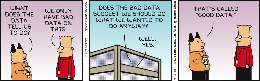
It is very hard to answer questions using past data, particularly when that data is limited or questionable. When data is extracted and prepared after the fact, it is very likely that this data is much lower quality than if we had made sure that it was going to be generated appropriately beforehand. There is also the danger of over-manipulating past data to fit your current assumptions. That is why we should strive to ask questions first, and then proactively design experiments to gather the kind of data that will answer them.
For every project we should aspire to set a hypothesis by asking the question of “Why?” at the onset. For example: “Why are we changing the color of our login button?”. The answer to a question like this might be something like “Because we expect users to log in at a higher rate if we use a different color”. The “why” question and its response can be easily rephrased as an experimental hypothesis. In our example this would be “Hypothesis: Changing the color of our login button will increase log in rate”. Some readers might recognize this “why” question as somewhat related to the so-called causal reasoning (see Book of Why). Strictly speaking, the data driven mechanisms and tools most people use and are described in this post do not necessarily enable causal inference, but they do get us a step closer for sure.
An immediate consequence of formulating hypotheses in this manner is that we can quickly derive what metric we are hoping to move and in what direction. In our running example we mentioned “log in rate”. Note though that when turning this into a measurable metric, we are likely to run into more concrete questions. What does “log in rate” mean? We could decide what we expect is for users that have never logged in before to log in now for their first session. Or maybe we do expect for this change to impact both new and existing users who logged in before. It might even be that we expect the direction of the change to be different! Because of this deeper discussion, in many cases we might end up breaking a hypothesis into several sub-hypothesis, and identify different metrics or groups of users to track independently. In our case, we might end up with something like:
- Main Hypothesis: Changing the color of our login button will increase the overall log in rate of our users as defined by [Metric] percentage of logged in sessions per user.
- Sub-hypothesis 1: Changing the color of our login button will increase first login probability of our new users as defined by [Metric] median number of logged out sessions before user logs in for the first time
- Sub-hypothesis 2: Changing the color of our login button will slightly decrease successive log in rate existing users as defined by [Metric] percentage of logged in sessions per user who had already previously logged in. This slight decrease is expected to be more than compensated by the increase of new users that we are going to convert to logged in.
Very importantly, we can now make sure that we have the ability to track the metrics we have identified as necessary to validate or invalidate the hypothesis. If the metrics don’t exist or are questionable, we should remedy it before the experiment runs.
The most common, but not only, approach to running such experiments in a product is AB testing. It is beyond the scope of this post to go over the many aspects that are required to run a good AB test (I will instead direct the interested reader to Ronny Kohavi’s Trustworthy Online Controlled Experiments ).
Hypothesis-driven experiments do not necessarily require an AB test. This is many times an excuse I have heard from people in other disciplines for not being strict with their experimental design. How can, for example, a UX research project be hypothesis driven? In our running example of the login button, we would show mocks of the site with the two colors to users and ask them how likely they are to log in. We could even develop two prototypes with the difference in color and let users play around with them in a controlled environment (although in this particular example this is probably not worth it vs. directly running a live AB test if our product is live already).
It is important to note that, in any case, sometimes reaching a conclusive answer will require several rounds of experimentation. This can be so for many reasons, but an important one is that we might not get data that conclusively and statistically proves or disprove our hypothesis. We understand that, and we might treat some answers as tentative in the meantime.
What about “exploratory” projects?
Whenever I describe the approach above, many folks react by asking “Do you mean that I can’t decide to prioritize an exploratory or discovery project for an area where I might not yet have a clear hypothesis?”. The answer is, of course, yes. Such projects might be important when entering a completely new space in order to uncover possible trends or generate ideas. However, these should be treated as exceptions, and should be explicitly called out. The corollary is simple: if your organization runs mostly exploratory projects or experiments, you are not in a data driven organization.
Metrics
A data driven organization should clearly define, document, and publish its metrics. Those metrics should be known and agreed upon at the appropriate level of the organization. Metrics and their documentation should be kept up to date, and any change to metric definitions should be documented in some form of changelog so that they can be tracked over time.
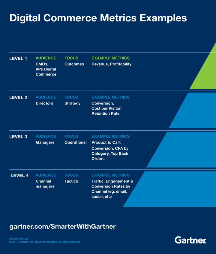
Metrics should be organized in a hierarchy such that the top level metrics represent the most important business metrics that drive the organization goals (see example from Gartner below). Those higher level metrics should be agreed upon and approved by the executive teams. Lower level metrics will be defined and maintained by the appropriate team leads.
The quantity of metrics an organization tracks does not define how much data driven they are. In fact, it is almost the other way around: A truly data driven organization should strive to have as few metrics as possible. Of course, the hierarchy described above means that different levels and parts of the the organization will care about a different subset of metrics. An important negative side effect of having too many metrics is that they end up not being important (“if everything is important, nothing is important). Another negative side effect is that maintaining too many metrics is hard, and it increases the chances that they become noisy and unreliable. This is what I call the “metrics death spiral”: too many metrics to maintain that become unimportant and therefore are maintained poorly, becoming even more unreliable, and therefore less important, and the organization responds by adding new metrics that feed into the problem, making it worse and worse.
An important litmus test for whether we should track and incorporate a given metric is whether it is actionable. In other words, will that metric inform something that can be actioned upon? Whenever anyone comes to me asking for adding a new metric, I ask them the following question: “How is that metric going to help you make a decision?”. We should be able to answer this question precisely for any metric we track. As an example, and going back to our login button, imagine that the percentage of logged in users is a metric we keep track of. What would happen if this metric all of the sudden drops without a clear cause? If the answer is that we would not do anything, we should then not track the metric. Very importantly, you should not track metrics just to satisfy someone’s curiosity (unless that someone is the person that is paying your organization, of course).
In this section so far we have described organizational metrics, but how do these relate to the experimental metrics mentioned in the previous section? Ideally, they fully overlap. In other words, when defining a hypothesis for a new experiment I would be wise to choose one that can be verified using a metric from the existing organizational metric hierarchy. Why? Well, because those metrics are supposed to represent what the organization cares about and prioritizes. Why would I want to run an experiment and change a metric my organization does not care about or prioritize?
In practice though, particularly if you are in a young organization (e.g. startup), it is likely that a new project with a new hypothesis will uncover a new metric.That is expected, and completely ok. My recommendation though is to then spend some time discussing whether that new metric is important enough to make it into the “select club” of the organization metric hierarchy. Make the actionability of the metric part of the discussion. And, remember that we don’t want to just continue adding every single metric we can think of to the hierarchy to avoid the metrics death spiral!
Data quality
A data driven organization strives to have highest data quality standards, and understands that poor data quality drives poor decision making. Because of this, it will not accept poor data quality, and will point to it whenever and wherever it manifests, with the goal of increasing overall quality over time. Accepting poor data quality is, as we saw, an important contributing factor to the metrics death spiral.
That being said, data driven organizations also understand that optimal data quality is a journey that is never complete, and that needs to be traveled incrementally. Sub-optimal data quality does not imply that you cannot start the journey towards a better data driven culture. Too often have I heard organizations throwing their arms up and saying they’d love to be data driven, but simply cannot trust their data. Start small, call out bad data when you see it, and caveat any decision that is made by using questionable data, using the process itself as an excuse to prioritize improving the quality of the data. And, as underlined in the previous section, remember that the more data and metrics you maintain, the harder it is to guarantee their quality.
Data accessibility
Everyone in a data driven organization should be able to access the data and metrics they need to make the optimal decisions. This means that we should give maximum visibility to metrics and data (taking into account of course possible privacy, security, and confidentiality constraints).
Access to data or metrics without context, and a minimum level of preparation might be counterproductive though (see example below). As a rule of thumb, an individual in a data driven organization should probably understand and care about the metrics that are directly connected to their team goals. This is probably a combination of a small subset of metrics at the appropriate level in the metrics hierarchy, and the top level metrics that are important for everyone.

Appendix: The right tool for the job
As alluded to in the sections above, there are different tools for being data-driven. Those tools have pros and cons. This appendix is a brief summary with some rules of thumb of how to decide what tool to use. Of course, the answer might be more nuanced and complicated, but treat these rules of thumb as a good starting point.
The “data-driven grade” is a relative metric that attempts to quantify how much the tool enables or facilitates the tenets above.
Dashboards
Use when: There is an actionable metric that you need to keep track of and need to look at frequently (e.g. more than weekly). Data-driven grade: C Why: While end users tend to love dashboards because they are flexible and easy to use, they hardly ever lead to good data driven decisions, they are costly to maintain, and can easily lead to metrics death spiral.
Ad hoc Data Report
Use when: There is an actionable metric that you need to understand at a point in time to make a decision, but you do not anticipate having to track over time. Data-driven grade: A Why: While ad hoc reports are not generally flexible and require work from specialists, they can be a good tool for analyzing situations without generating unnecessary complexity and maintenance.
Periodic Report
Use when: There is an actionable metric that you need to understand periodically to make a decision, and anticipate having to track every now and then to revise the decision.. Data-driven grade: A- Why: A periodical data report is simply a bit more cumbersome to maintain than an ad hoc report. However, it is a great tool to highlight trends and changes in the metrics that are already part of the hierarchy
A/B Test
Use when: You are making a change to the product/service for which you need a reliable response on whether the hypothesis is correct. Importantly, only to be used if the volume of data that will be gathered allows for the result to be significant (note that this depends on things like the duration of the experiment, but also whether you are measuring differences upstream of the funnel or deep in the product). Data-driven grade: A+ Why: A/B tests promote hypothesis driven development and are a key component of most data driven organizations. They are costly to set up, and generally not very flexible for the end user who receives the results. However, they get us close to understanding the “why” and therefore enable us to make good data driven decisions.
Tracking metrics change due to a product launch
Use when: You want to understand the impact of a product change, but cannot afford to do an A/B test because you cannot meet necessary criteria (e.g. amount of data) or doing that could be too complex or costly. Note that you can track a product launch related metric using any of the first three tools described (dashboard, ad-hoc report, or periodic report). The pros/cons will depend on this choice. Data-driven grade: B-
Others
There are other tools for data driven decision making that are beyond the scope of this post. For example, for experiments, besides A/B testing, you can use Quasi-experiments, interleaved experiments, or multi-armed bandits. If there is interest, and I have time, I might get to them in a second part.